The brief was a list of thirty images that we needed to capture while wandering around Bath. Some of them were quite obvious, like "at work" or "a bird's eye view" while others were a bit more abstract and would require more lateral thinking. I was shooting digital on my Canon EOS600D, while some others were shooting film. Kev said that we should all treat the exercise as if it were on film, thereby only taking one shot of each subject and then moving on. He said he would check file numbers at the end, so we couldn't delete any and re-shoot! I really tried to be true to this but it wasn't long before I started deleting the crap shots. Problem is I would see something that ticked one of the boxes, only to find something far more suitable later in the day. I can live with it.
Here are a few of the best shot I took on the day, along with their titles:

"At work" or "Dog"

"Someone with a camera who is not on the course"

"Bad hair day" (sorry Andy Penn, lol)
"Danger"

"Youth" or "Rat's eye view"

"Bird's eye view" (groan)

"Matching pair"

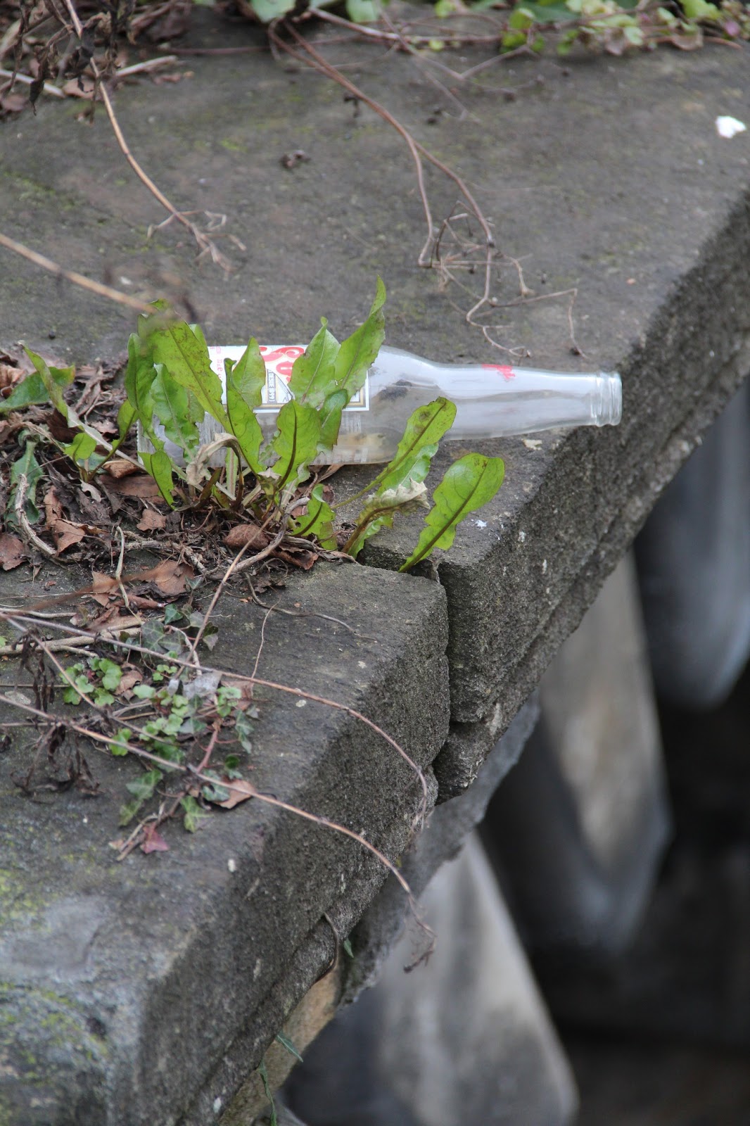
"Dog"

"At work"

"Matching pair"
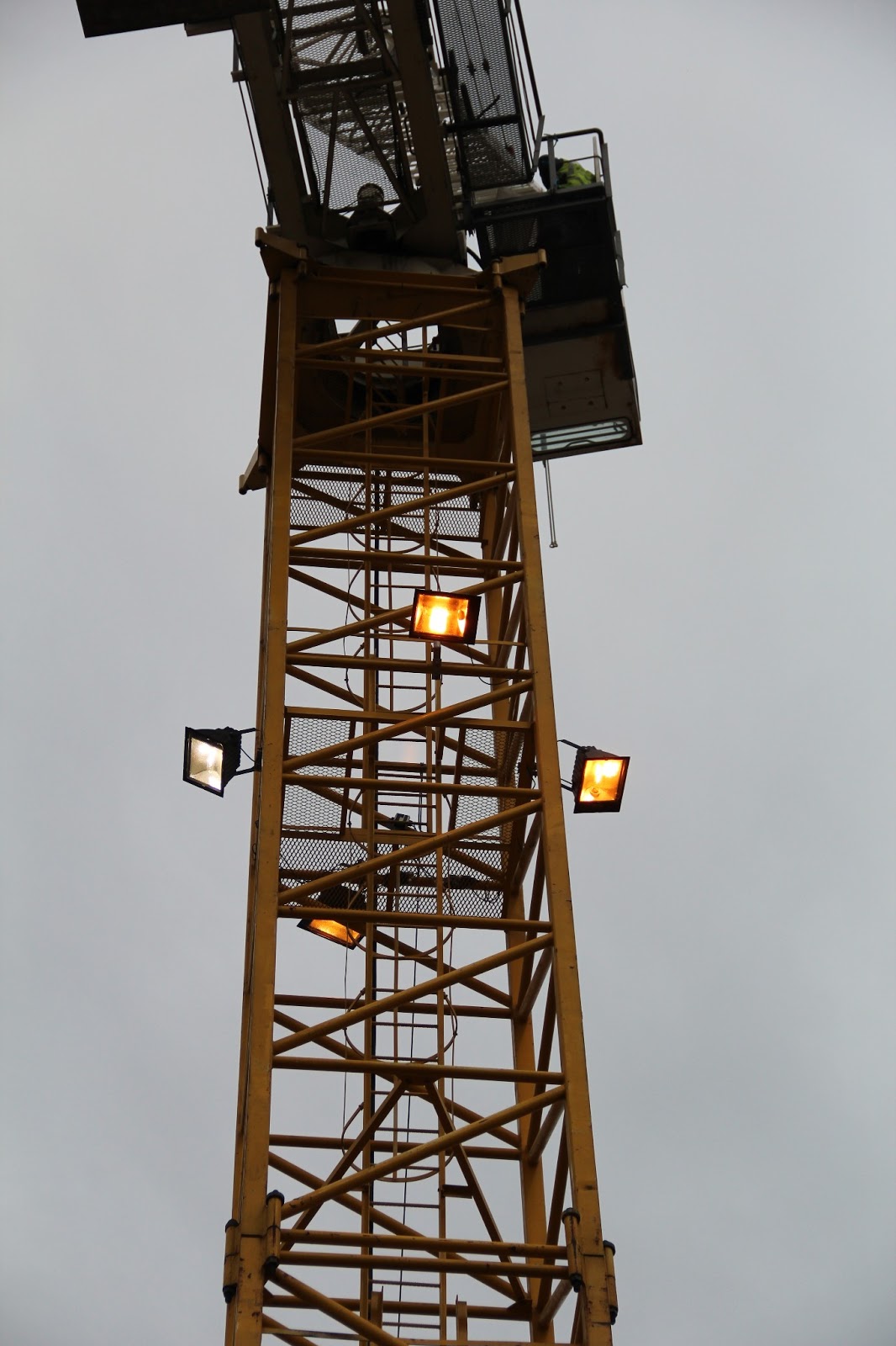
"Lights by day"

"Bad hair day" or "Duotone"

"Perspective" or "Bad hair day"

"Self-portrait at arms length"

"Chaos"
All in all it was a really great day. I didn't manage to do any nice street portraiture but I did learn a valuable lesson - in order to do that sort of stuff you have to not give a shit and actually go and talk to people. Sol was amazing at this and I didn't see him get turned down once. I think he benefited from being a naturally happy, smiley kind of guy, and also because he has been doing loads of this type of work for his "A is for Afro" project. Fair play to him but it's not for me.
I was lucky enough to spend the whole day wandering around in a small group with Kev, so I got to ask quite a few questions and, perhaps more importantly, watch a pro at work. It was pretty funny watching him throw himself to the ground even in the middle of the street to get the right shot.

One of the other highlights of the day was stopping at the Jazz Cafe for one of their enormous "Big Breakfasts". Kev ordered one first and I was never going to shy away from an eating challenge. Suffice to say we both finished this:

When we got back to uni we all did a bit of a show and tell. I was not that happy with many of my shots. They are all okay but nothing really jumps out as special. We were all really impressed with Ali's shots, which it turns out he had cross-processed. This is a method that Kev uses quite a bit, whereby you shoot on slide film but then get is processed as standard colour negative. The results are really contrasty with over-saturated colours. It looks great, in classic lomo/instagram style, but surely that is then not really down to the skill of the photographer, is it? I thought about trying it for myself but turns out that slide film is about £10 for 24 exposures, which I simply cannot afford right now. Instead, I tried to achieve the same sort of effect in Photoshop:

I've never been a fan of over-processing but I actually think that shot of Sol and Taavi is rather nice. It looks almost 3D. Perhaps there is something to be said for fiddling around in Photoshop after all...


